
Redox is the modern API for healthcare. Redox was founded in 2014 and the company’s headquarters is in Madison, Wisconsin.
1. User Experience and Design
Redox’s uses its website to educate Healthcare organizations and capture leads through various methods. The site excels in branding and design with only minimal areas of improvement where design can increase the conversion rate.
 The bottleneck is in establishing where and how the website is used as a part in the overall marketing strategy. Redox would likely benefit the most from clarifying its goals, intended user journey, and improving how the site executes that.
Speed – According to one of our speed tests, redoxengine.com took 8.9 seconds to fully load. Decreasing the page load time would allow for a bigger number of visitors to reach the site and a better user experience. Studies show that 40% of people abandon a website that takes more than 3 seconds to load and 47% of consumers expect a web page to load in 2 seconds or less.
According to one of our tools, the average time spent on site by visitors is 6 minutes and 57 seconds and the bounce rate is 43.10%. Increasing the time spent on site and lowering the bounce rate can positively impact multiple metrics such as search rankings.
Tagline – The above-the-fold subheadline sells the service, but focuses on the features rather than the benefits.
Is seamless data sharing an industry pain point?
Does their potential client know about it?
What result will they get out of it? Time? Peace of mind? Lower support costs?
Call To Action (CTA) – The site is employing one good practice by placing the primary CTA above-the-fold. Format wise, only one main call-to-action is recommended rather than two.
Less options is preferred. There is a small visual indicator (an arrow) but a more prominent one can be used to guide the eye. If the visitors are scrolling through the page quickly, this will show them where they should stop, if anywhere.
The below-the-fold section can be improved. The background fits and looks nice, but the rest of the elements do not serve their purpose effectively. The text is a little hard to read, lacking contrast against the vibrant background. We believe that the headline does not reiterate the solution or answer the pain the business is solving. Custom button text is used to drive the action but can be pushed further.
User Journey – There are too many funnel paths and there isn’t a single and clear desired path that leads towards an intended action.
The main goal of the site is to capture leads for Healthcare organizations. This is accomplished through educating users on how their service will work for them by using testimonials, examples, and case studies.
Currently, there are four primary actions that directly compete with each other by asking the user for their time or information.
– Schedule an intro call through a call calendar scheduling service.
– Provide a free healthcare integration consultation through a contact form
– Download a free guide to integrate with Redox
– Sign up for a webinar
One solution is to make sure each page has a single, finite goal, to move the user through the pages that convince them of Redox’s offer, and capture through a single point.
Funnel Flow – There are several funnels that direct users towards a goal.
Homepage > Schedule a call
Homepage > Webinar
Homepage > Solutions > Contact form
Homepage > Solutions > FAQ > [None]
Homepage > Solutions > Download guide
Homepage > Solutions > App Gallery > Pilot application form
Homepage > Solutions > Case Study Overview > Case Study PDF > [None]
Homepage > Solutions > Contact
We believe these funnels should all point to the primary goal unless there is a funnel for a user in another part of the buyer journey. Some of the funnels do not have any CTAs at the end, like the Case Studies, which open as a PDF.
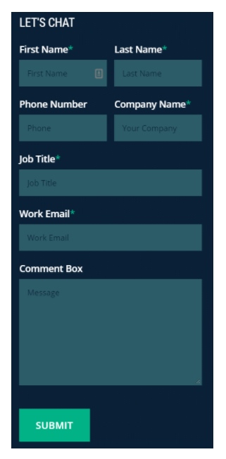 Lead Capture – The footer contact form can have less friction (i.e. fields) for a user to submit data. We believe there are too many fields and too many required fields.
The contact page has several design elements that make this form clear and concise. The header and subheadline work well and the visual arrow indicator points to the form, guiding the user. The biggest conversion factor here is the number of required fields. Does Redox really need all this information to provide them with a free healthcare integration consultation? We believe as few fields should be used as possible.
There are a handful of popups used throughout the site in a tasteful manner. They appear as they sense that the users are about to leave the page. They are also specific to the page the user is on, rather than being a generic text box. There would be the much benefit in split-testing the copy on popups that appear on the higher traffic pages to see if the conversion rate can be improved.
Branding – There is a consistent color palette throughout the site being used effectively. The overall theme conveys a feeling of data and technology.
Redox uses a primarily text-based logo with a hint of an abstract symbol that alludes to what they do. The logo appears in their favorite icon in a unique style that stands out in a bookmark or browser tab.
All headings, paragraph text, and call-to-action areas are mostly consistent throughout the website. However, from our prespective, the call to action buttons are too consistent lacking visual hierarchy.
Chances are that there is a priority or importance rank for each button, decreasing the further down the page we go. Ideally, buttons are broken into 3 levels of important with a corresponding treatment type:
– Primary actions
– Secondary actions
– Tertiary actions
The actual button texts or destinations might change throughout the site, but with a visual hierarchy, the user will have an easier time scanning the page and have a (subconscious) idea of where to click and what’s important.
On the “Solutions” subpages, some pages switch button color to their secondary color, orange. This change in style would require the user to remember more short-term visual information as they navigate the site.
Page Flow – The structure is consistent in having a Header > Body > CTA > Footer
The content flows well from one section to another in the natural order a user might have questions in their head as they navigate the site.
 Mobile – Redoxengine.com is mobile friendly. It has all the mandatory features to optimize the experience for mobile, such as using a hamburger menu style navigation, large, easily-clickable buttons, and appropriately scaling the size of page elements.
Firstly, this is nitpicking and very minor, only improving the aesthetic. Text that exceeds 3 lines should be aligned to the left instead of centered or else it is harder to read.
Within the first 3 seconds a user should know what the page is about. The header should have a headline, subheadline, and primary CTA visible on every page. Most pages check this requirement but some subpages need to have the header positioned higher so the primary CTA button is visible.
This is a result of less than ideal responsive design, which hasn’t accounted for varying desktop widths.
App Gallery – Showcasing relevant portfolio examples is a crucial step in the buyer journey when a user is interested in a product or service. The first impression shows company logos listed, which don’t look like app icons. Users would be more inclined to glance over the logos because there isn’t an indicator to show how each will open a summary. This can be remedied by showing one opened summary above the grid of logos, or by changing the style of the logos to resemble app store icons, which are squares with rounded corners.
When an app is opened, it shows a very broad and general overview. There isn’t much more detailed information about how the app is used or the results it proved for the company using the app.
In our opinion, the gallery filter is not as user-friendly because it resembles filters that would be more appropriate for shopping, rather than viewing. The steps to see apps in a specific niche can be too cumbersome for the user.
2. Blog & Content Marketing
Redox has a blog on their website. Creating and publishing more blog posts would be a good way to increase organic traffic while at the same time increasing Redox’s credibility.
In addition, Redox does not publish content on Medium.com. Publishing content on Medium would be a good way to reach a bigger audience, drive traffic and increase brand awareness.
Look and Feel – We believe there is a disconnect from the rest of the brand identity Redox has established throughout the main site that isn’t apparent here. Most noticeably, it lacks the color palette and uses what appears like stock photos for the posts’ featured images rather than the graphical style the site is comprised of.
If Redox decided to focus on a content marketing strategy, the design lacking congruency may confuse visitors who came from an ad or even from the main site.
Side bar – Most blogs don’t need an introduction. The “Welcome” section takes up too much real estate. Users visit blogs, and consequently posts, looking to learn more about a specific topic. Again, if Redox focused on content marketing, count on repeat users who are visiting the blog, who don’t need an introduction every time.
The Sponsored Badge is distracting and seems out of place. If it’s selling ad space, it would be better to place it at the bottom of the footer.
 The “Subscribe to Email Updates” is a weak-ask, especially compared to the exit intent popups and other lead magnets (like the guide) that exist. Tracking sign ups from this form would be crucial data that would ultimately tell if it’s serving a purpose here.
The Tweeter feed is an OK effort of showing some social proof, but since the Twitter page lacks retweets, this section would be better utilized with something that supported a marketing campaign. Since most of the site’s goals revolve around capturing an email, using something like a lead magnet would make most sense to stay consistent with the rest of the site.
Blog posts – The color style lacks brand congruency overall. There are inline links that feature the brand’s primary color, but lacks any other elements that were more prominent on the main site.
Each post features share buttons in the most appropriate channels where its users spend time.
The bottom of the posts lose clarity on what the intended actions are, like the email opt-in. This looks too similar from a contact form field and isn’t clear on why the post is asking for an email.
The share buttons at the bottom of the post are placed well, with consistent choice of share options.
The author bio is also a good effort to personalize the articles and give readers insight to the content creator, which can set the groundwork for a person to establish a following in a topic.
We think the comment section lacks clarity, just like the email opt-in, since it looks very similar to a contact form. This can be easily confused for a form that gets sent to the Redox instead of a public comment. Recommend using a 3rd party comment system like Disqus, that is easily recognizable.
The most noticeable missing component in our opinion is a section for “Related Posts.” Showing related posts based on tags is an effective way to increase reader time on site.
If using the blog as part of a content marketing strategy is in the future, there is potential for the blog to have more lead capture elements, such as Content Upgrades or opt-in bribes.
3. Email Marketing Teardown
Redox collects visitor’s email addresses on their website. This means they’re building a targeted email list. Email marketing has been proven to deliver the highest return on marketing and engagement investment out of all digital marketing channels.
4. Social Media Teardown
Twitter: @Redox
Redox currently has 4,744 Twitter followers.
In the last 6 months, they tweeted 1.52 times per day. By being more active on Twitter they can acquire more followers and grow their audience.
Retweets make up 33.48% of all of their tweets – putting out more original content can create more engagement.
Redox replied to 7% of their tweets – a higher number would indicate a better user interaction.
Redox uses 0.39 hashtags in their tweets on average – the higher this number, the more likely their tweets are to be found in search.
33.48% of Redox tweets get retweeted and 53.57% of their tweets get favourited – the higher these numbers, the more more will Redox be considered a valuable source of information by others.
* For a full report with graphs, stats, key data, and other suggestions please contact us directly.
Facebook: https://www.facebook.com/redoxengine
Redox currently has 287 Facebook fans. In the last month their Facebook audience has grown by 1.41%. A bigger audience and a higher growth rate on Facebook would mean a greater brand reach and more potential customers.
There are 11 people talking about them on Facebook. With the amount of likes they have Redox should be able to engage more followers.
Redox posts 0.72 times per day. Publishing more often would allow for a wider audience reach, a higher engagement rate and increased perceived value for followers.
Redox is not using hashtags in their posts. Using hashtags can expose their brand to more users.
Redox engagement rate is 3.83%. (Total number of people talking about them divided by the total number of likes). A higher engagement rate would increase the number of people they are organically able to reach on Facebook. For example, Redox can ask more questions in its posts. Posing questions to fans is a great way to activate them and gain insights of their needs. In general, the more Redox engages with their audience, the more often they’ll appear in the newsfeed, and the quicker their brand’s presence will grow.
* For a full report with graphs, stats, key data, and other suggestions please contact us directly.
Redox has a LinkedIn account but does not have YouTube and Pinterest accounts. Creating additional social media presence can increase web traffic and enhance brand awareness.
5. Video Marketing
Redox does not have an explainer video or any form of digitally produced video on their website. Adding videos is a good way to increase conversions, credibility and improve user experience. Videos have also been proven to increase search engine rankings and can also be used effectively for paid advertising.
Redox does not have a YouTube channel. Creating a YouTube channel and publishing content consistently would be a great way to drive additional organic and free traffic to redoxengine.com.
6. Search Engine Performance
According to one of our tools, redoxengine.com has 514 backlinks from 140 referring domains. It’s organically ranking for 1,228 primary keywords.
Redox currently receives about 13.2k organic clicks each month. Building more backlinks would likely increase this number.
Redox’s domain authority is 42/100 and page authority 51/100. Domain authority predicts this root domain’s ranking potential, page authority predicts this page’s ranking potential. The higher these numbers, the higher 60db-s chances to rank organically. These numbers can be increased by building additional backlinks and enhancing search engine optimization.
The top 5 keywords that bring most of Redox’s traffic are: redox, red ox, epic integration, re dox, redox software. Some of these keywords can be ranked higher to gain even more traffic. Additionally, Redox would maximize it’s organic traffic by targeting keywords with a higher search volume.
The majority of the keywords Redox is ranked for do not rank on the first page of search engine results. Research has shown that more than 90% of traffic comes from first-page search results and that over 80% of clicks come from first four organic listings. A good strategy for increasing traffic would be to work on increase the rankings of those specific keywords.
Most of Redox traffic is coming from United States, Belgium, India, Germany, and Philippines. Expanding to additional countries, whether with SEO or paid marketing, would be a good way to build additional traffic and audience.
* For a full report with graphs, stats, key data, and other suggestions please contact us directly.
7. Affiliate Program
Redox does not seem to have an affiliate program. Having an attractive affiliate program would be a good way to rapidly increase sales while at the same time keeping costs under control. Redox would only pay affiliates if the referral takes the desired action.
8. Paid Advertising
Redox is currently bidding on a number of unique keywords using Google Adwords. There are numerous additional keywords Redox should consider bidding on. Increasing the number of paid keywords would be a good way to further increase paid traffic.
According to our data, Redox is not using Adwords alternatives. Redox should consider diversifying and expanding to other Paid Advertising Channels. For example, we’ve witnessed great results with Facebook Ads, Bing, Taboola and Outbrain ads.
9. Security Teardown
Redoxengine.com does not have known malware and it’s not blacklisted.
The site does not have a firewall. This poses a medium security risk as it makes Redox website considerably easier to hack.
Redox is using an SSL certificate issued by Let’s Encrypt Authority X3. This means data and sensitive information are more protected.
10. Media & Press Releases
Redox receives media coverage. We’ve identified a few articles in major publications and online news sites.
For example, this article at xconomy.com: Lucigen, EnsoData, Rowheels, & More: This Week’s Wisconsin Watchlist.
Getting more coverage from the media can boost Redox brand awareness, website visitors and increase search traffic.